Tutorial 03: Distributions
Q1 — Standard Normal - Left Tail Probability
Compute \(P(Z <= 1.25)\), where \(Z ∼ N(0,1)\).
NoteInfo
Remember: R calculates area to the left unlike probability tables.
NoteInfo
This is the graphical representation of the question:
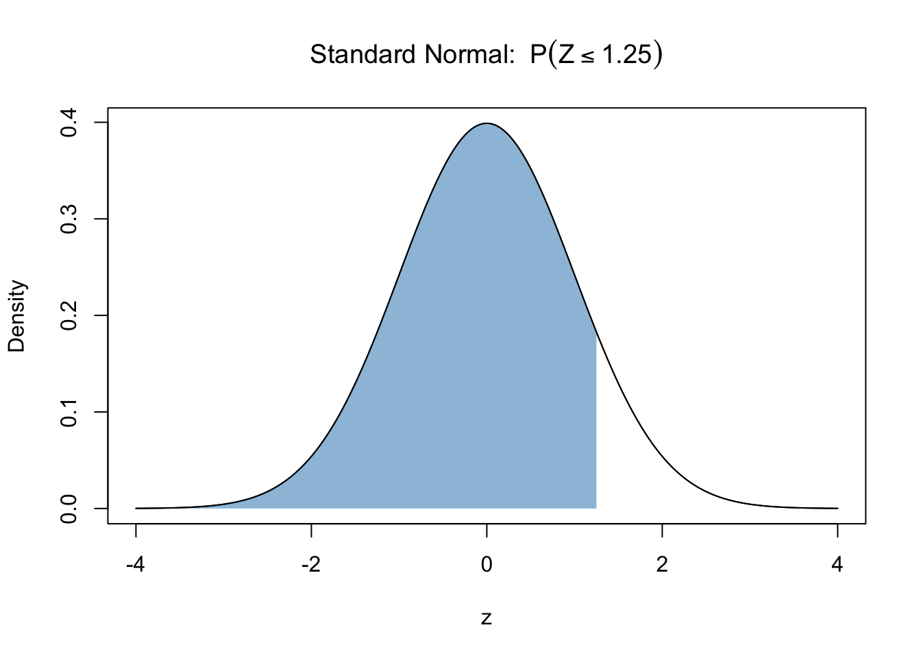
Use pnorm.
pnorm(1.25)
pnorm(1.25)Q2 — Standard Normal - Right Tail Probability
Compute \(P(Z >= 1.25)\), where \(Z ∼ N(0,1)\).
NoteInfo
Remember: R calculates area to the left unlike probability tables.
NoteInfo
This is the graphical representation of the question:
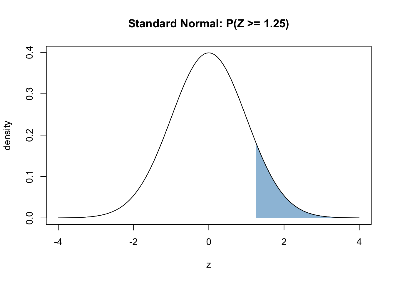
pnorm gives area to the left. Remember, we need area to the right.
1 - pnorm(1.25)
1 - pnorm(1.25)Q3 — Standard Normal - Two-Sided Probability
Compute \(P(∣Z∣ >= 1.25)\), where \(Z ∼ N(0,1)\).
NoteInfo
Remember: R calculates area to the left unlike probability tables.
NoteInfo
This is the graphical representation of the question:
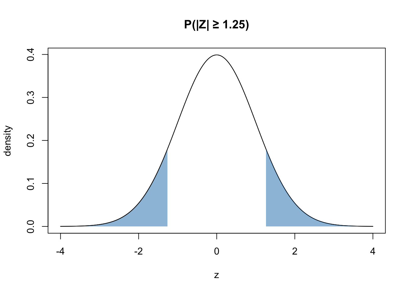
Effectively use pnorm.
p_two <- 2 * (1 - pnorm(1.25))
p_two <- 2 * (1 - pnorm(1.25))Q4 — Normal Quantile (Critical Value)
Compute \(Z_{0.975}\) where \(Z ∼ N(0,1)\).
NoteInfo
This is the graphical representation of the question:
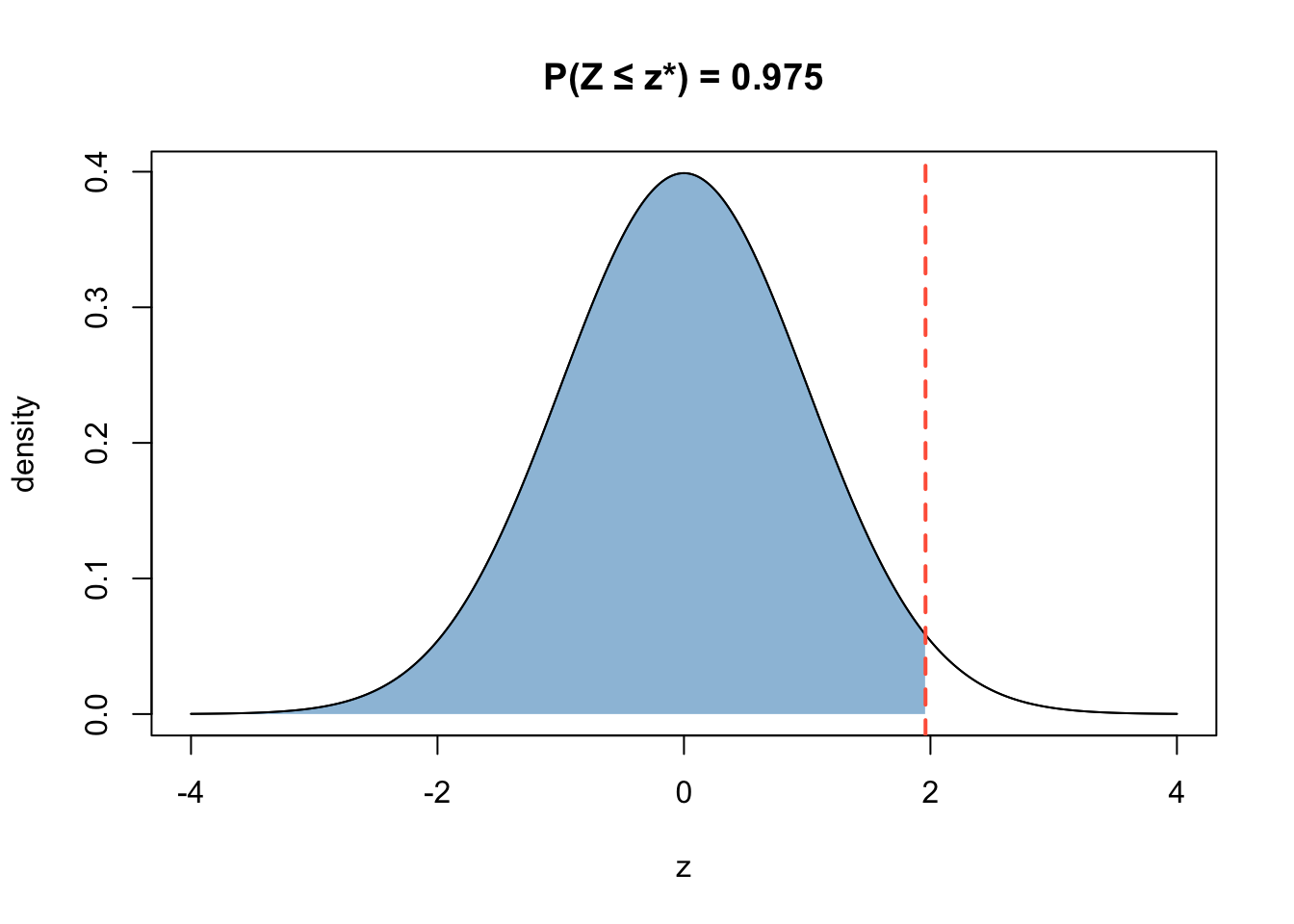
Use qnorm.
qnorm(0.975)
qnorm(0.975)Q5 — T-distribution - Right Tailed
Let \(T ∼ t_{10}\). Compute \(P(T >= 1.5 )\).
NoteInfo
This is the graphical representation of the question:
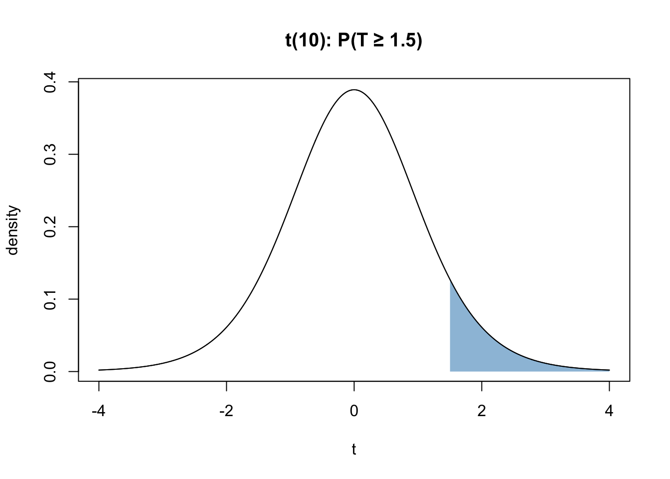
Use pt.
1 - pt(1.5, df = 10)
1 - pt(1.5, df = 10)Q6 — T Quantile - Left Probability
Find \(t^*\) such that \(P(T <= t^*)\) = 0.975, where \(T ∼ t_{10}\).
NoteInfo
This is the graphical representation of the question:
Use qt.
qt(0.975, df = 10)
qt(0.975, df = 10)Q7 — Chi-Square Distribution - Right Tailed
Let \(X ∼ {\chi^2}_{8}\). Compute \(P(X >= 15 )\).
NoteInfo
This is the graphical representation of the question:
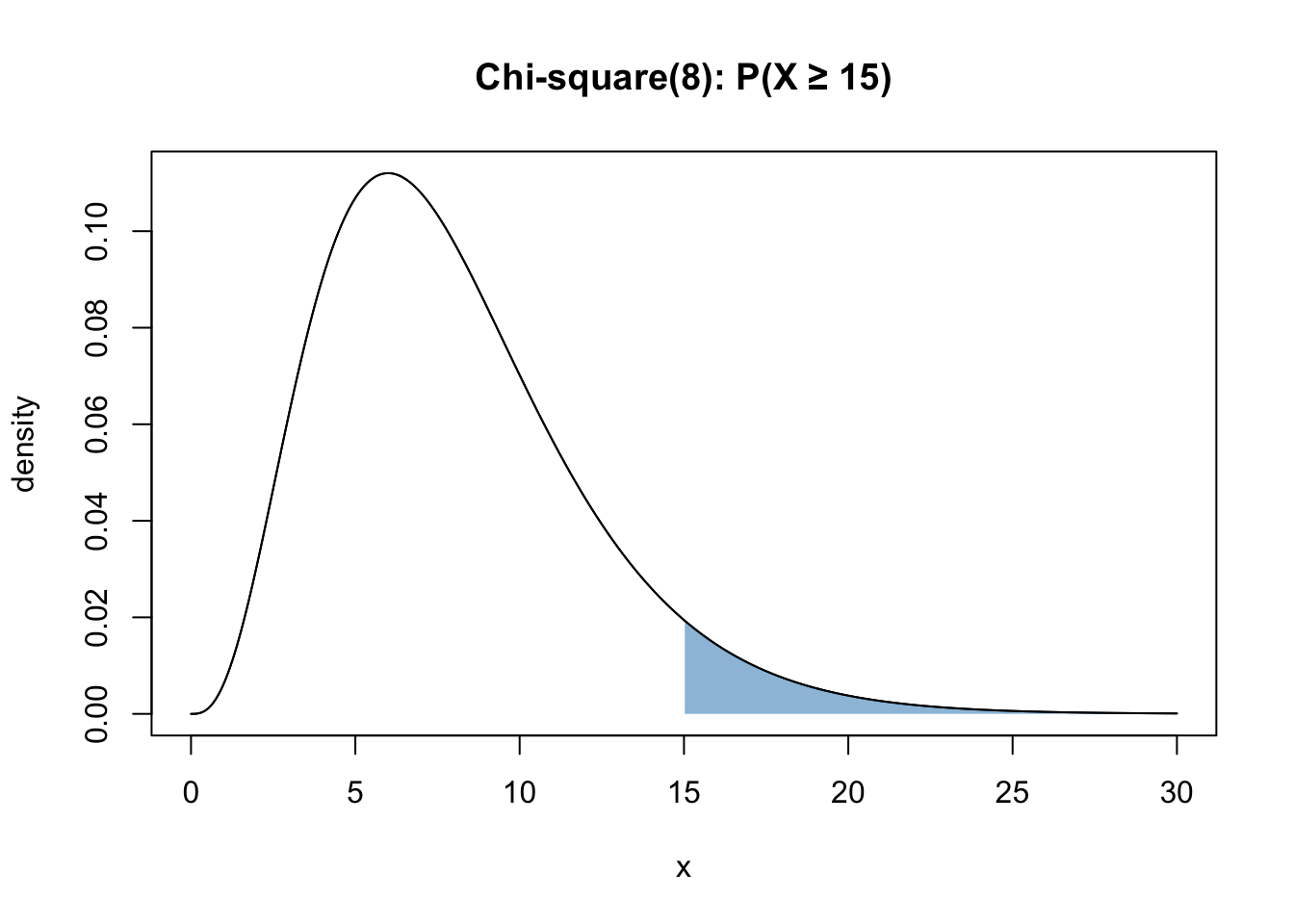
Use pchisq.
1 - pchisq(15, df = 8)
1 - pchisq(15, df = 8)Q8 — Chi-Square Quantile - Left Probability
Find \(x^*\) such that \(P(X <= x^*)\) = 0.95, where \(X ∼ {\chi^2}_{10}\).
NoteInfo
This is the graphical representation of the question:
Use qchisq.
qchisq(0.95, df = 10)
qchisq(0.95, df = 10)Q9 — F Distribution - Right Tail
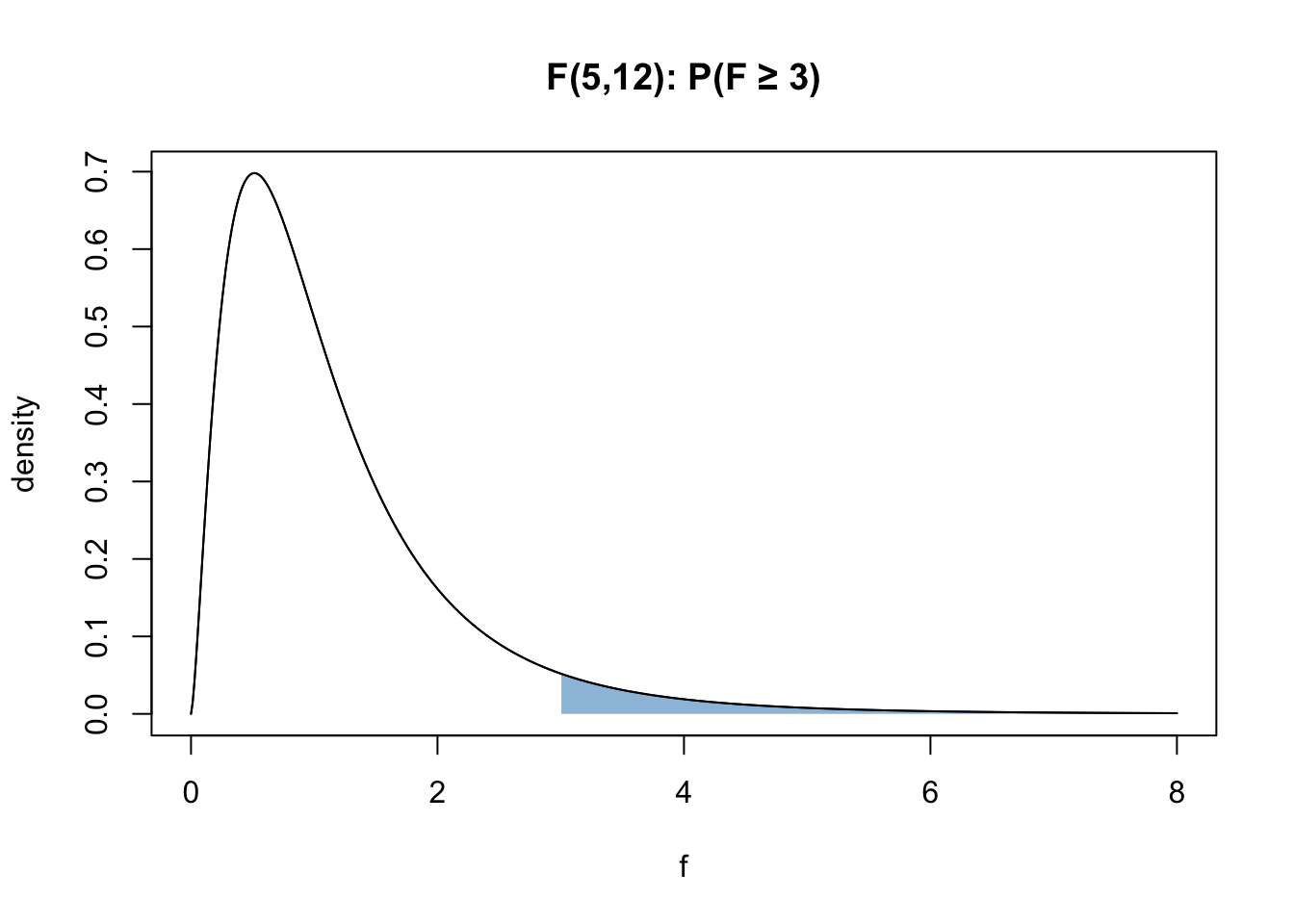
Let \(F ∼ F_{5, 12}\). Compute \(P(F \ge 3)\).
NoteInfo
This is the graphical representation of the question:
Use pf.
1 - pf(3, df1=5, df2=12)
1 - pf(3, df1=5, df2=12)Q10 — F Quantile - Left Probability
Find \(f^*\) such that \(P(F <= f^*)\) = 0.95, where \(F ∼ F_{3, 20}\).
NoteInfo
This is the graphical representation of the question:
Use qf.
qf(0.95, df1=3, df2=20)
qf(0.95, df1=3, df2=20)Q11 — Overview with Skimr
The question below has a dataframe df created from the dataset msleep that contains data about mammal sleep traits. Make a skim summary of df and store it in ms_skim. Print it to see your result!

NoteInfo
Info : skimr is an R package that provides summary statistics a user can quickly skim to understand their data.
Use the skim function from skimr.
library(ggplot2)
library(skimr)
df <- msleep
ms_skim <- skim(df)
ms_skim
library(ggplot2)
library(skimr)
df <- msleep
ms_skim <- skim(df)
ms_skim
Q12 — Histogram with ggplot
Build a ggplot histogram of sleep_total with binwidth = 1 by replacing the __ with the correct answer. Save the plot to p_hist. Fill the histogram with any color of your choice!
NoteInfo
Info : ggplot refers to the ggplot2 package in R, a powerful tool for creating statistical graphics.
Look up how to make plots with ggplot.
library(ggplot2)
p_hist <- ggplot(df, aes(sleep_total)) +
  geom_histogram(binwidth = 1)
p_hist
library(ggplot2)
p_hist <- ggplot(df, aes(sleep_total)) +
  geom_histogram(binwidth = 1)
p_hist
Q13 — Scatterplot with ggplot
Make a scatterplot of bodywt (x) vs sleep_total (y), \(log_{10}\) scale on x, with a smooth trend (Read info to understand what these terms mean), by replacing the __ with the correct answer. Save the plot to p_scatter. Fill the scatterplot with any color of your choice!
NoteInfo
Info : ggplot refers to the ggplot2 package in R, a powerful tool for creating statistical graphics.
NoteInfo
Info : 1) A \(log_{10}\) scale on the x-axis transforms the x values before plotting.This spreads out small values and compresses very large ones. As an exercise, also try removing that argument and see how much harder it is to visualize the data without it.
- A smooth trend line is added along the points by using geom_smooth(). This leads to better visualization of trends in the data.
Look up how to make scatterplots with ggplot.
library(ggplot2)
p_scatter <- ggplot(df, aes(bodywt, sleep_total)) +
  geom_point() +
  scale_x_log10() +
  geom_smooth(se = FALSE)
p_scatter
library(ggplot2)
p_scatter <- ggplot(df, aes(bodywt, sleep_total)) +
  geom_point() +
  scale_x_log10() +
  geom_smooth(se = FALSE)
p_scatter
Q14 — Mean and Standard Deviation
Compute the population mean and standard deviation of sleep_total. Save them in mu and sigma. Note that x is the vector containing sleep data pulled from the dataset.
NoteInfo
Info : This and the following examples illustrate the power of the Central Limit Theorem (CLT). CLT states that for a sufficiently large sample size, the sampling distribution of the sample mean will be approximately normal, regardless of the shape of the original population distribution.
R has direct commands to compute mean and standard deviation. Look into those.
mu <- mean(x)
sigma <- sd(x)
mu <- mean(x)
sigma <- sd(x)
Q15 — Sample Mean and Sample Standard Deviation
B = 200 samples of size n = 10 with replacement from x are stored in means_10. Compute the following: m_10 = Mean of means_n10, s_10 = Standard Deviation of means_n10
R has direct commands to compute mean and standard deviation. Look into those.
means_n10 <- replicate(B, mean(sample(x, n, replace = TRUE)))
m_10  <- mean(means_n10)
m_10
s_10    <- sd(means_n10)
s_10
means_n10 <- replicate(B, mean(sample(x, n, replace = TRUE)))
m_10  <- mean(means_n10)
m_10
s_10    <- sd(means_n10)
s_10
Q16 — Visualizing the Distribution
Make a histogram of means_n10 (binwidth = 0.5), and add a vertical dashed red line at the population mean mu. Save the plot in plot_clt and print it. Fill the plot with any color of your choice!
NoteInfo
Notice the distribution of the sample mean here and see if it resembles a normal distribution. Which theorem is in play here?
Refer to previous exercises for learning how to plot a histogram. To draw a vertical line at a certain intercept, use the ggplot command- geom_vline .
library(ggplot2)
p_clt_n10 <- ggplot(data.frame(m = means_n10), aes(m)) +
  geom_histogram(binwidth = 0.5, fill = "grey80", color = "white") +
  geom_vline(xintercept = mu, linetype = 2, color = "red") +
  labs(x = "sample mean (n=10)", y = "count",
                title = "Sampling distribution of the mean (n = 10)") +
  theme_minimal()
p_clt_n10